The Cassette & Vinyl Revival: Crafting Micro-Layouts for Physical Media with an AI Band Logo Creator
The modern music industry is witnessing a massive, unexpected shift back to physical goods. While streaming platforms dominate daily consumption statistics, independent musicians, underground record labels, and niche genre collectives are discovering that digital files alone cannot satisfy true audiophiles. Genres like Lo-Fi hip-hop, Vaporwave, City Pop, synthwave, and underground punk have sparked an absolute renaissance in physical audio merchandise. For these communities, releasing music on cassette tapes and vintage vinyl records is no longer a gimmick—it is a vital source of revenue and a definitive statement of artistic identity.
However, moving your music from a digital master tape to a physical product introduces a complex set of production challenges that most digital artists are completely unprepared to face. When you upload a track to a digital aggregator, your primary visual concern is a square image asset that scales automatically on a bright screen. When you manufacture physical media, you enter a world governed by strict mechanical dimensions, bleed lines, and real-world ink absorption rates.
The biggest crisis usually occurs during the print proofing stage. An indie group will spend weeks finalizing a beautiful, intricate graphic on a high-resolution screen, only to discover that it looks like an unreadable blotch of black ink when shrunk down to fit the narrow spine of a cassette shell or the small center label of a seven-inch vinyl record. To avoid these costly manufacturing mistakes, artists need an agile layout system that allows them to deconstruct, adapt, and optimize their visual assets for micro-printing environments.
The Technical Nightmare of Physical Micro-Layouts
To understand why a great digital graphic can fail in the physical world, you must examine the specific blueprints of retro music formats. Each medium has strict spatial limitations that force designers to change how they approach layout composition.
The Cassette J-Card and Spine
A standard cassette tape case contains a paper inlay known as a J-Card. The front cover of the J-Card offers a decent rectangular canvas, but the most important piece of real estate is the spine. The spine is the narrow strip of paper that faces outward when the tape is stacked on a storage shelf. It measures only a fraction of an inch in width. If your primary group identity relies on a wide horizontal wordmark or a complex illustration with fine circular borders, scaling that graphic down to fit the spine will make the text completely unreadable.
The Vinyl Center Label
Vinyl records present a completely different geometric challenge. The center label of a record is a small circle with a large physical hole punched directly through the exact middle. If your primary branding places a crucial design element, a central icon, or a core piece of text right in the middle of the layout, that entire section will be permanently cut out by the factory machinery during production.
Vinyl Center Label Hazard Matrix:
+———————————–+
| [ Top Typography Area ] |
| [Left Icon] ( HOLE ) [Right] |
| [ Bottom Typography Area ] |
+———————————–+
Warning: Central graphic elements will be destroyed by the center spindle punch.
When you encounter these physical restrictions, you quickly realize that you cannot use a single, static image file for every promotional application. You need a modular visual identity system that can be split apart, rearranged, and modified without losing its core brand recognition.
Overcoming Spacing Bottlenecks with Modular Design Elements
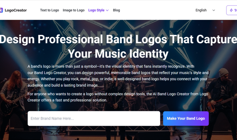
To build a print-ready physical asset layout that retains its professional appearance across all mediums, you must utilize tools that offer extreme flexibility over individual typography parameters and vector structural objects. This is where an advanced band logo creator becomes an essential asset for independent record labels and self-released artists.
Instead of fighting with rigid image files or locked templates that break when you resize them, a smart generation engine gives you direct control over the individual DNA layers of your brand asset. If you are prepping an asset for a narrow cassette spine, you do not want to scale down the entire image group. Instead, you want to extract the pure text element, adjust the tracking to increase the space between letters, and rotate the typography ninety degrees to run perfectly along the vertical axis of the paper inlay.
Using a dynamic system allows you to build a cohesive visual ecosystem consisting of three distinct variations:
- The Master Badge: The complete combination of icon, typography, and background borders, optimized for the main album jacket or a t-shirt print.
- The Linear Wordmark: A streamlined, text-only option with wide letter spacing, specifically optimized for long, narrow physical spaces like cassette spines or structural borders.
- The Isolated Emblem: A pure, bold symbol stripped of all surrounding text, perfect for stamping onto small circular surfaces like the center of a vinyl record or the plastic outer shell of a tape cassette.
Step-by-Step Guide: Optimizing Your Identity for Retro Prints
If you want your physical merchandise to look like a high-end collector’s item rather than a rushed home project, you must adapt your workflow to accommodate the realities of physical production. Follow this guide using an agile digital band logo creator to prep your layout files for the factory line.
Step 1: Simplify Your Geometry for Low-Resolution Prints
Physical inks spread slightly when pressed onto matte paperboard or raw plastic shells. This natural phenomenon is known as “dot gain.” If your lines are too close together, the ink will bleed across the gaps and blur your design. Use the platform to select bold, high-contrast structural templates with clean geometric lines. Avoid complex shading, gradients, and ultra-fine textures that are meant exclusively for back-lit digital monitors.
Step 2: Utilize Extreme Letter Spacing for Narrow Spines
When text is shrunk down to fit a miniature layout, human eyes need extra contrast to distinguish between individual letters. Open your design file within the editing workspace and systematically increase the tracking (the uniform horizontal space between characters). A wide, tracked-out font looks incredibly sophisticated and remains completely legible even when printed at a tiny text size on a vertical cassette insert.
Step 3: Isolate and Adapt the Icon for Vinyl Center Circles
To create a stunning vinyl label, load your design into the editing suite and temporarily hide or delete the main text elements. Take the central icon and scale it up so that it comfortably wraps around the outer edge of the imaginary center spindle hole. By isolating the symbol, you ensure that the record looks balanced while spinning on a turntable, without worrying about text getting clipped by the physical punch machine.
Step 4: Export High-Contrast Vector Formats
Never send low-resolution web graphics like standard compressed JPEGs to a commercial print house. When you finish refining your micro-layouts, use the high-resolution export features to download pure vector formats like SVG or transparent, lossless PNGs. Vector files do not contain pixels; they are built on mathematical formulas. This means you can scale your optimized micro-design down to a tiny scale or blow it up onto a massive concert banner, and the edges will remain perfectly crisp and razor-sharp.
Building Lasting Value Through Tangible Branding Assets
In a digital landscape where millions of tracks are uploaded daily, physical music objects have become the ultimate symbol of fan loyalty. A listener might forget a song they added to a massive digital playlist, but a collector who buys a beautifully designed cassette tape or a heavy gatefold vinyl record will cherish that object for decades.
Do not let amateur layout issues ruin your physical release or drive up your manufacturing costs with endless factory rejection emails. By utilizing an intelligent, adaptable online creation tool, you can preview your concepts, manipulate structural layers, and produce highly specialized micro-layouts in real time. Take control of your visual production pipeline, protect your print budgets, and ensure your physical merchandise looks just as powerful as your music sounds.