The Role of Product Page Customization in Reducing Drop-Off on Shopify Stores
Product page drop-off is rarely about low intent. It often happens when a custom shopify product page does not remove uncertainty at the moment of selection. This becomes more pronounced in variant-heavy catalogs, where unclear images or option states interrupt confidence. Do shoppers hesitate because the selected color or size does not clearly match what they see?
Usability guidance such as Google’s Web Vitals user experience framework and Shopify’s product page UX guidelines both emphasize stability and responsiveness as foundations for confident interaction. When pages feel inconsistent, especially on mobile, hesitation increases. This blog is here to show how product page customization reduces friction through clearer structure, visual clarity, and intentional interaction design.
Why Drop-Off Commonly Happens on Shopify Product Pages
Drop-off on product pages reflects hesitation during evaluation, not rejection of your product. Default Shopify pages work technically, but they often fail to guide shoppers clearly when multiple choices are involved.
Common evaluation breakdowns that slow decisions:
- Variant overload that forces shoppers to compare too many options at once without visual guidance.
- Stock states revealed only after interaction, which interrupts momentum and creates doubt.
- Mixed image galleries that require shoppers to scroll and cross-check manually.
- Pricing or availability updates that lag behind variant selection.
Why dropdown-based variants increase effort:
- Shoppers must remember previous selections instead of seeing confirmation.
- Differences between options remain abstract until after selection.
- Mobile users face extra friction due to small tap targets.
- Rechecking choices becomes necessary before adding to cart.
Each added step increases pause time and raises the likelihood of exit.
What a Custom Shopify Product Page Changes at the Decision Point
Customization restructures how information appears at the moment a shopper decides. Instead of adding visuals, it reduces the mental effort required to confirm a choice.
How a custom shopify product page changes evaluation flow:
- Variant options appear as clear, recognizable choices instead of text-heavy controls.
- Visual confirmation updates immediately after selection.
- Information is grouped by decision relevance rather than page order.
- Only necessary details are visible at each step.
Effects of improved hierarchy on decision speed:
- Shoppers stop scanning the page for reassurance.
- Evaluation time shortens because confirmation is immediate.
- Confidence increases without relying on urgency cues.
- Add-to-cart becomes a natural next step.
Clear structure supports commitment by removing doubt, not by applying pressure.
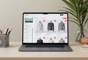
Variant Presentation as the Core of Product Page Customization
Variants create the highest decision load on Shopify product pages, especially as your catalog grows. Each added option increases the number of checks a shopper performs before committing.
Where variant complexity commonly increases hesitation:
- Shoppers rely on memory instead of visible confirmation.
- Availability feedback arrives late in the selection process.
- Option labels fail to communicate practical differences.
- Variant-specific details appear in multiple sections.
How scaling catalogs amplify the problem:
- More combinations increase the chance of mismatched images.
- Long option lists make comparison slower and less accurate.
- Mobile screens magnify layout and clarity issues.
- Shoppers hesitate longer to avoid wrong selections.
Understanding where friction repeats helps isolate structural gaps rather than surface design issues.
Common Variant-Related Friction Points That Increase Drop-Off
These failures appear consistently when variant presentation is not organized around decision clarity.
Recurring usability issues you may recognize:
- Selected variants not reflected in product imagery.
- Hidden or delayed out-of-stock feedback.
- Long dropdowns that obscure meaningful differences.
- Variant-specific details scattered across the page.
When these issues compound, shoppers must self-verify every choice. Clear variant presentation replaces that effort with immediate confirmation, reducing hesitation while supporting confident decisions.
Visual Customization That Supports Faster Product Understanding
Visual elements on a product page work best when they explain, not decorate. When visuals reduce scanning and rechecking, shoppers understand the product faster and move forward with more confidence. Image volume matters less than visual clarity and alignment with choices.
To support faster understanding, your visuals need to confirm decisions instead of forcing interpretation.
Ways visual structure shortens evaluation loops:
- Images grouped by variant so each selection shows only relevant visuals.
- Removal of unrelated images that require manual cross-checking.
- Clear visual boundaries between options that prevent comparison fatigue.
- Immediate visual feedback when a selection changes.
How swatches replace interpretation with recognition:
- Colors and patterns are identified instantly instead of decoded from text.
- Shoppers rely on visual memory rather than rereading labels.
- Option differences remain visible during comparison.
- Selection confidence increases without additional explanation.
Mobile Product Page Customization and Its Impact on Drop-Off
Most product page hesitation appears first on mobile because limited space magnifies structural flaws. When interaction feels uncertain on smaller screens, shoppers pause longer or abandon the page.
Mobile-specific friction often comes from controls designed for desktop behavior.
Mobile interaction issues that slow decisions:
- Dropdowns that require repeated taps and scrolling.
- Long pages that hide confirmation below the fold.
- Small touch targets that increase misselection risk.
- Variant changes that do not visibly update the page.
How tap-friendly controls reduce abandonment:
- Variant options presented as buttons instead of menus.
- Clear spacing that supports accurate thumb interaction.
- Visual confirmation placed close to selection controls.
- Reduced need to scroll back and forth.
Simpler interaction lowers effort and helps shoppers commit without hesitation.
Performance and Load Behavior in Customized Product Pages
Customization does not automatically reduce performance when structure is intentional. Stability and responsiveness support trust during selection and help shoppers stay focused on their decision.
Disruptions often occur when page elements behave unpredictably during interaction.
Performance-related behaviors that interrupt confidence:
- Layout shifts that move content after selection.
- Delayed image updates that leave choices unconfirmed.
- Visual changes that occur without clear cause.
- Interaction feedback that arrives out of sequence.
How stable behavior supports decision flow:
- Selected variants update visuals without repositioning content.
- Page elements remain anchored during interaction.
- Feedback appears immediately after input.
- Shoppers maintain orientation throughout the page.
Consistent behavior allows shoppers to focus on choosing, not recalibrating.
Measuring Whether Product Page Customization Is Reducing Drop-Off
Measurement confirms whether hesitation has been reduced rather than proving that change occurred. When you observe behavior instead of surface metrics, patterns become easier to interpret.
Look for signals that reflect confidence during selection rather than speed alone.
Behavioral areas worth monitoring:
- Variant interaction paths before add-to-cart.
- Image engagement after selection.
- Support inquiries related to wrong choices.
- Completion behavior tied to option changes.
Signals That Indicate Product Page Customization Is Working
These signals appear consistently in session data and customer feedback when decision friction decreases.
Observable confirmation signals include:
- Fewer rapid variant switches before add-to-cart
- Reduced gallery scrolling after selection.
- Lower correction or exchange requests.
- Higher completion after variant interaction.
When these signals move together, shoppers are no longer compensating for unclear structure. They are selecting, confirming, and proceeding with confidence.
Where Shopify Merchants Typically Over-Customize
Customization can improve clarity, but excessive customization often reintroduces friction. This is not a design mistake. It is a structural issue where too many elements compete during evaluation.
Over-customization usually appears when every idea is added without checking its role in the decision.
Patterns that dilute decision clarity:
- Multiple persuasive elements displayed at the same time.
- Badges, icons, and messages layered without clear priority.
- Visual emphasis applied equally to all options.
- Repeated reassurance that interrupts selection flow.
How restraint supports better decisions:
- Only one primary action remains visually dominant.
- Supporting cues appear only when relevant.
- Visual hierarchy guides attention instead of splitting it.
- Shoppers confirm choices without distraction.
Intent-based customization keeps focus on selection, not stimulation.
Conclusion
Product page drop-off often comes from uncertainty during variant evaluation rather than lack of interest. When structure supports clear comparison and visible confirmation, you reduce hesitation at the moment of choice. Thoughtful customization removes the need for rechecking and replaces doubt with clarity, allowing shoppers to move forward with confidence.
Effective customization strengthens clarity, stability, and interaction confidence across the page. When visuals confirm selections, layouts remain stable, and interactions feel predictable, shoppers stay oriented and committed. Maintaining this balance helps your product pages remain effective as your catalog expands, without introducing unnecessary complexity or distraction.